I have another reveal of our freshly painted house for you today—our living room! This was actually one of the first spaces in the house that I painted white. It’s also our most-used room in the house, so even though I painted it back in November, I haven’t been able to take photos without little people scampering in and rearranging things. Luckily the stars aligned and I snapped a few photographs. I will note, though, that the room is not heavily styled because of the “little people” reason above. Nevertheless I think you will be able to see the impact the white paint has had on this space. What was once dark and yellow is now a light and airy living room.
We moved into our home in 2014, and this is basically how the living room looked for the next five years.
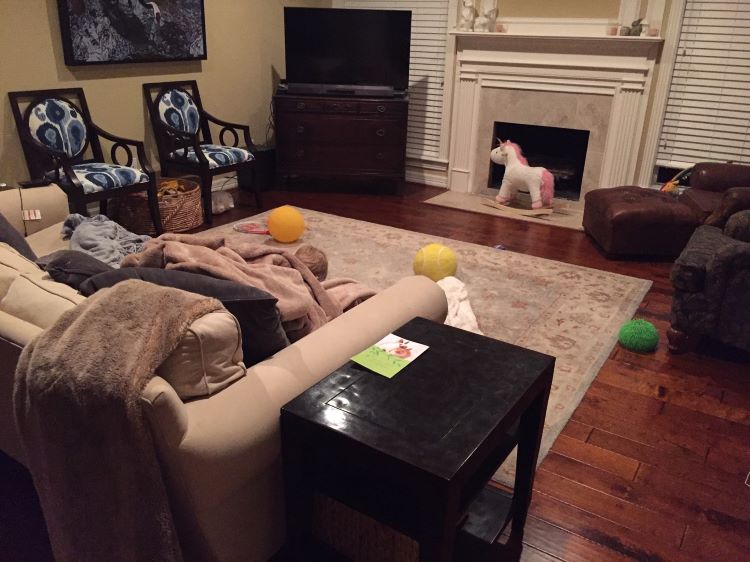
I had tiled the fireplace (see how I did it here) and finished reupholstering the blue chairs by the time this photo was taken. But you can see the general furniture layout and prior warm-yellow paint color in this photo.
The funny thing is that the previous owners used this room as a traditional “formal” living room. I remember touring the house and wondering if they ever sat on their near-pristine couch and chair. There wasn’t even a TV in the room!
The “formal” usage of the living room pretty much went out the window when Mr. L and I moved in. And this was all because of our first “baby”—our Restoration Hardware Grand-Scale Sofa. The couch the first piece of “adult” furniture we bought after getting married in 2010. And being tall, we went with the “grand” size. Somehow the couch fit into our 700 square foot apartment in Austin. But it wouldn’t fit anywhere in our new house except for in the formal living room. After Lamborghini was born, the formerly formal living room naturally became our main living area and toy central.
After five years, we thought it would be a good time for a change. I already knew I wanted to paint the walls white. But I also wanted to move away from the classic traditional decor to a more modern style. We freshened up the room by shopping our house to change out some of the furniture. And Mr. L indulged me one evening and helped me move around the furniture. Admittedly, this process admittedly took forever because there was as lot of tweaking involved. But the hard work paid off.
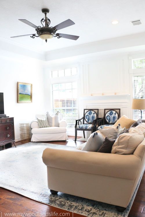
Here’s how the room looks now! A light and airy living room.
Our Furniture Updates
For the most part, the big items in the room have not changed. That couch will be with us until the kids stop spilling. The dresser-turned-console-table was my grandmother’s, and I love watching our youngest flip the antique pulls up and down like I used to do. You’ll also notice that we didn’t change out the light fixture because it gets hot here in Texas. Ceiling fans are a fixture in every Texas home.
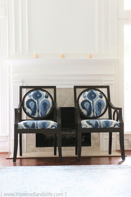
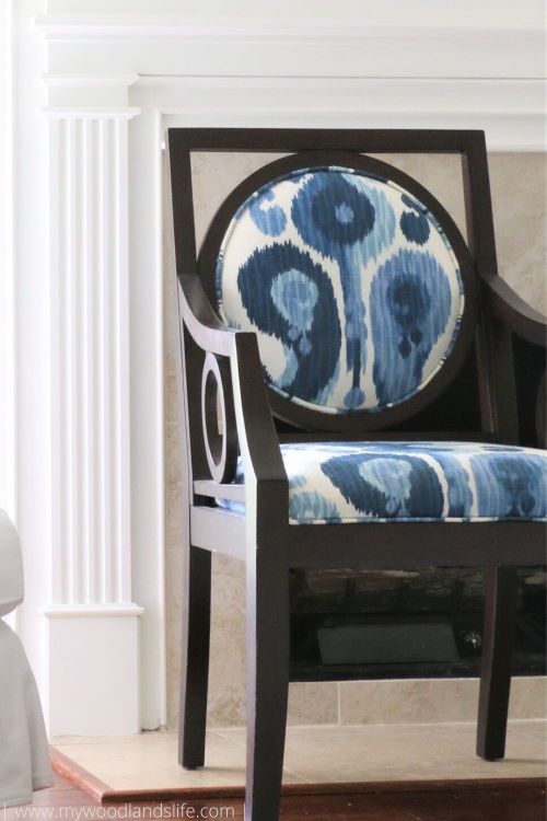
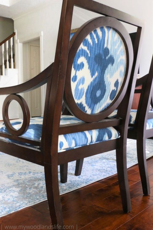
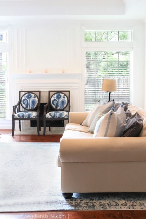
I was excited that we found a way to keep the blue chairs in the mix too. The chairs were a fun upholstery project that I completed a few years ago. I obsessed over this fabric from Ballard Designs for the longest time and found the perfect thrift store chairs to upholster.
I adore how they turned out. While the chairs are currently functioning as a baby gate to stop our newest crawler from entering the fireplace, it is my hope that I will one day pull them away from the fireplace because the back of the chairs are so darn cute.
In October, I ordered the blue rug (linked here). It was extremely inexpensive for a 9×12 rug (I paid around $100 total for it). On the one hand, I got what I paid for because the rug is very thin. But we plopped it on top of our 8×10 Pottery Barn wool rug to add extra cushion. Now I get the plush feel of the wool rug, and the kids are able to eat and snack on top of the new polypropylene rug at will. I may eventually add a larger jute rug underneath the blue rug to bring a bit of a coastal vibe to the room. But we are happy with just the blue rug for now.
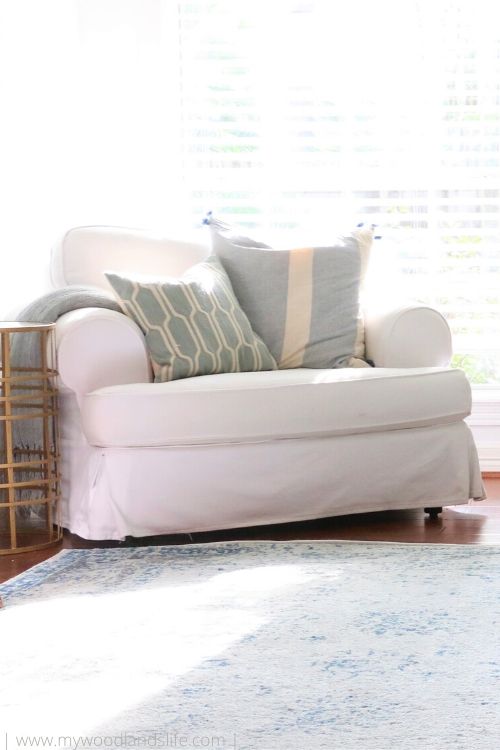
Aside from the rug, the only “new” pieces in the room are the white chair, which I borrowed from our master bedroom, and the circular metal table next to the white chair. The table had been in a guest room upstairs for several years and desperately needed a new home.
A New “Light” Layout
I love natural light. My routine every morning is to walk around the house, often with a baby in tow, and open all of the blinds in each room. The living room is in the center of our house and only gets morning sun. With the yellow walls, it would appear very dark during the day, even on a sunny afternoon. Opening the blinds was nearly impossible with the TV in front of one of the windows and a giant chair in front of the other. It was also hard to clean behind said heavy furniture. Plus no one wanted to watch TV with a blinding light shining behind the TV.
One of my favorite parts about the new furniture layout is that I can access both windows easily. I simply walk behind the couch to get to the window on the right. The white chair on the left is low enough that I can easily reach the pull cord behind it. And now that the room is painted completely white, I get the blinds-open effect throughout the day.
Here’s a look at the room from a sightly different angle. Initially, we were inclined to push the couch against the back wall so the kids could have a larger play area on the floor. However, the TV was hard to see from that distance (total first world problem, I know), so we pulled the couch forward and away from the wall about 24 inches. This small change had a huge effect on the room. It made all of the furniture feel much cozier and the room became more conversational. It is also really nice to be able to walk behind the couch when cleaning. I’m on the search for cube-shaped ottomans to leave behind the couch for impromptu foot rests. I’m also debating whether we should add a thin console table back there, but I’m not sure if we really need it.
Across from the couch is our toy basket and former time-out chair (aka the “happy chair”). I used to keep all of the kids’ downstairs toys in the basket. But these days the kids spend most of their time making “cat caves” out of pillows and forts out of blankets. Plus toys would be everywhere. I’ve since transitioned most of the toys to a different room and leave this basket out for soft toys and blankets.
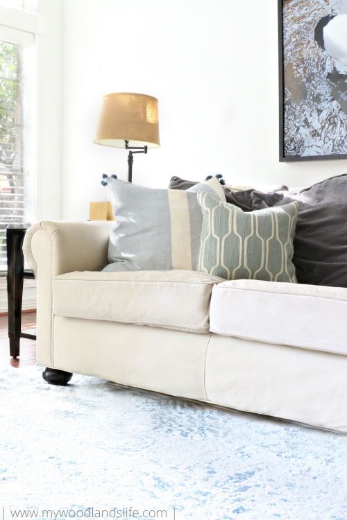
Another thing that I hope to update one day is our throw pillow “situation.” Right now we are using IKEA throw pillow covers and the polyester inserts. If you saw their condition when I wash them you would understand why. The smaller blue pillow is from Pottery Barn, and we have had it for years. I did splurge on two Serena and Lily pillow covers around Christmastime. I have a thing for tassels. Plus I’m obsessed with coastal decor (see my post here). So when I see light blue and tassels together on sale, I bite. The Serena and Lily pillows are called “Mommy’s pillows,” and the kids aren’t allowed to use them for play. They seem to abide by this rule, which brings me hope that I can eventually add more big kid pillows to the couch and move their IKEA pillows to a stack on the ground. One day I hope to have all real pillows with real feather inserts.
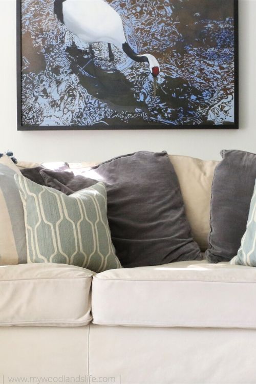 The bird artwork in the background is a piece that Mr. L and I have had for years. It is by a Texas artist named Debbie Stevens. Her work is truly amazing. She uses oil paint and medium to achieve the water effect on the canvas. A neat side story is that Ms. Stevens forgot to sign the painting when Mr. L and I originally purchased it, so she and her husband drove up to Austin to sign the painting in person. They are seriously the nicest couple.
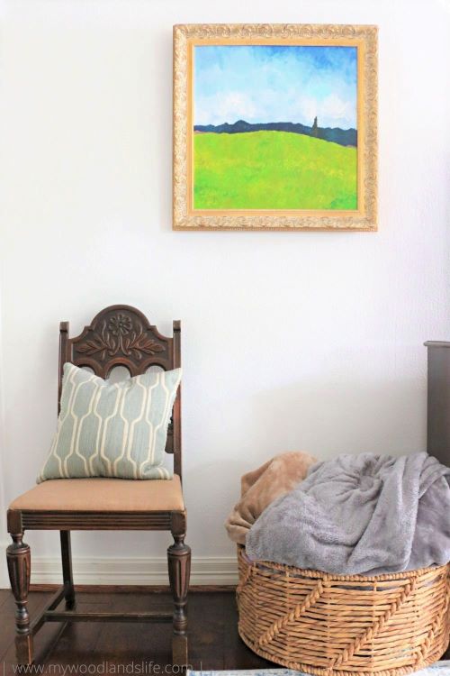
I painted the landscape artwork on either side of the console table. They’re based on a photo I took while Mr. L and I were visiting family in Portland. In case you didn’t notice, they also serve as the backdrop for my blog title bar. I put the landscapes in antique gold frames to make them look a bit more professional. I don’t particularly love painting art, but I can do it and I will do it for the sake of decor and saving money. I have a few more art pieces around the house that I will share at a later date.
One thing that is missing from this room is a large coffee table. I plan to add one eventually, but the kids enjoy lounging on the floor and setting up their playthings. So it will be a while. I also want to add those ottomans! But other than those few items, I’m incredibly happy with how the room has turned out.
I mentioned that this was the first room I painted white. Our entryway opens up into the living room, so once I painted this room I had no choice but to paint the entryway and hallway leading off of it (check out that post here in case you missed it). I still have a bit more painting to do (which is why you haven’t seen any photos facing the entryway). Hopefully I’ll be able to do a full downstairs tour soon. For now I hope you’ve enjoyed this living room makeover. It’s been fun seeing the house transform with just a little bit of paint (and furniture-moving muscle).


Leave a Reply